Get field statistics with Statist/QGIS
QGIS statistics plugin description
Обсудить в форуме Комментариев — 0
The goal of Statist is to provide some basic statistics in text and graphical (frequency distribution histogram) form for the selected field of the vector layer. Both numeric (integer, real, date) and text (string) fields are supported. You can work with the whole layer or only with selected records.
If you found a bug, want to make suggestions for improving Statist, or have a question about this plugin, please email me or leave message on our forum. I hope this tool will be usefull.
Installation
You can get this plugin from GIS-Lab repository.
The plugin is designed for QGIS version 1.0 and higher. It also depends on matplotlib — Python 2D plotting library. If you want to use this plugin you need to install matplotlib first. If there is no matplotlib in your system, you'll see error message on QGIS startup.
For those who use OSGeo4W online installer obtaining and installing matplotlib very simple. Matplotlib package available through under libraries. In other case you can download it from project home page (http://matplotlib.sourceforge.net) and install manually.
Work with plugin
After the plugin installation and startup by clicking ![]() button main window will appear:
button main window will appear:
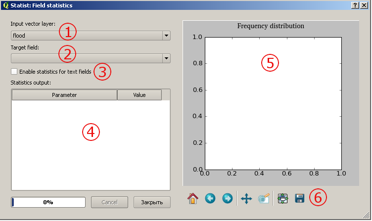
1 — layer selection. Only vector layers are listed.
2 — fields selection. By default only numeric fields listed there, but you
can use checkbox3 to switch to the text fields
3 — switch between numeric and text fields (this changes contents
of 2)
4 — statistics output area
5 — histogram area
6 — navigation toolbar, see Navigation chapter
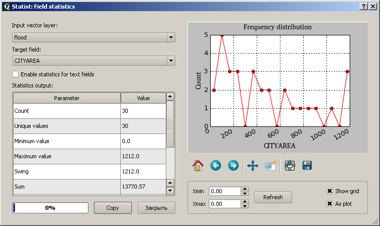
Statistics computation begins immediately after user selects a field from the list, the progress of this operation is showed with progressbar. After computation plugin window will look like this
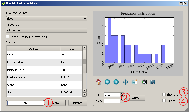
Some controls change their state and some new controls appear:
1 — Copy button. Copy statistics output to clipboard.
2 — fields Xmin, Xmax and button Refresh allow you change limits of X axis, so you will
have more detailed view of some interval. To do this enter appropriate values in the field and
then press Refresh button
3 — show/hide plot grid (see screenshoot above)
4 — switch between bar histogram or linear plot representations
of your data (see screenshot above)
Navigation
Most of the above explanations are from the matplotlib manual (chapter 4 Interactive navigation).
Navigation toolbar is located below the plot area.
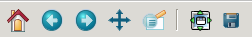
You can use it to navigate through the figure. Here is a description of each of these buttons.
 |
Home. Similar to the web-browser Home buttom. It returns you to the first, default view of your data. Use Pan/Zoom and Zoom-to-rectangle to define new views. |
 |
Back. Similar to the web-browser Back button. Used to navigate back between previously defined views. Have no meaning unless you have already navigate somewhere else using the pan and/or zoom buttons. This is analogous to trying to click Back in your web-browser before visiting a new page — nothing happens. |
 |
Forward. Similar to the web-browser Forward button. Used to navigate forward between previously defined views. Have no meaning unless you have already navigate somewhere else using the pan and/or zoom buttons. |
 |
Pan/Zoom. This button has two modes: pan and zoom. Click the toolbar button
to activate panning and zooming, then put your mouse somewhere over an axes. Press the left mouse button and hold it to pan the figure, dragging it to a new position. When you release it, the data under the point where you pressed will be moved to the point where you released. Press the right mouse button to zoom, dragging it to a new position. The X axis will be zoomed in proportionate to the rightward movement and zoomed out proportionate to the leftward movement. Ditto for the Y axis and up/down motions. |
 |
Zoom-to-rectangle. Click this toolbar button to activate this mode. Put
your mouse somewhere over and axes and press the left mouse button. Drag the mouse while
holding the button to a new location and release. The axes view limits will be zoomed to the
rectangle you have defined. There is also an experimental "zoom out to rectangle" in this mode with the right button, which will place your entire axes in the region defined by the zoom out rectangle. |
 |
Subplot-configuration. Use this to configure the parameters of the subplot: the left,
right, top, bottom space, space between the columns and space between the rows. In Statist this button enabled but you don't need to click on it. There are no subplots, so there is nothing to configure. Later I'll completely remove this button. |
 |
Save. Click this button to launch a file save dialog. You can save plot in following formats: PNG, PS, EPS, SVG and PDF. |
See also
Последнее обновление: September 09 2021
Дата создания: 03.08.2009
Автор(ы): Александр Бруй, Максим Дубинин
Enter
What's new 
Creating multi-level tiles from QGIS project with QTiles 
Rendering vector data with Mapnik without direct access to the storage
Geoprocessing with SEXTANTE for QGIS
Remote sensing Corona data - description and access
Subscribe to news
New on forum
Feedback
© GIS-Lab and authors, 2002-2013. Attribution to GIS-Lab and authors is required. The responsibility for the content of this article rests with the author (more).